Client
Striders Edge
Project
Rebrand
Overview
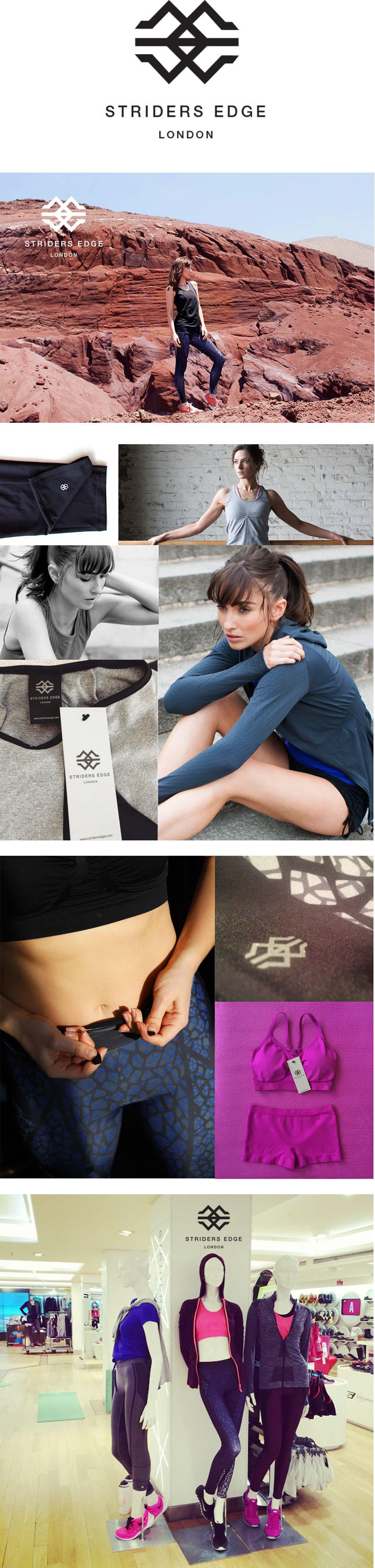
Striders Edge is a luxury women’s activewear brand
selling online and in-store at Harrods.
The Brief
To create a new logo and look and feel for Striders
Edge to match the high end quality of the product
as the existing look wasn’t doing that anymore.
The logo needs to be used across multiple platforms
ie clothing, water bottles, yoga mats, head bands etc
so it can’t be too detailed as it needs to work scaled
right down as well as on a larger scale. Versatility will
be reqiured. It needs to represent strong women of
the world without being too femine or too butch.
Women who love a challenge and laugh in the face
of danger! Was I up to the challenge??
Delivered
After presenting numerous logo options to the client,
the strong, geometric quality of this logo appealed.
It also retains the triangular aspect from the existing
logo which represented the Striding Edge Mountain.
The geometric thick strokes represent strength and
power. The symmetry represents balance. There is
also a disguised letter E for ‘Edge’ to signify living on
the edge. It went down very well!
The colours are bold which work in harmony with the
logo and the amazing photography. Overall, a success!

Eighty One Fairies
© 2012
Mobile
07875 483 527